Whether you’re looking to make a bold statement or create a neutral background, updating a room’s paint color is a simple way to make an immediate impact. Several top designers share their tried-and-true favorite colors they rely on again and again in their design projects.
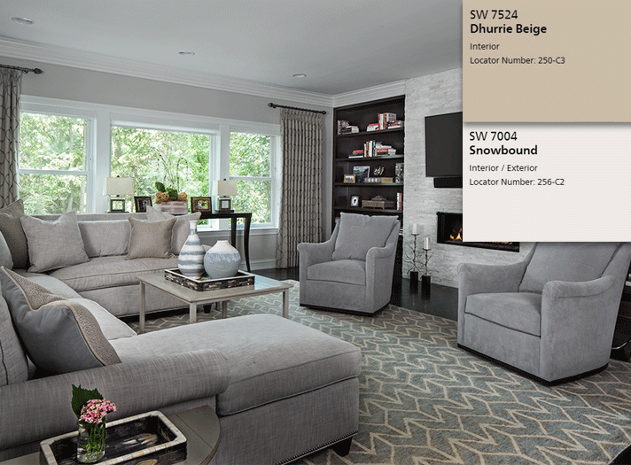
“The photo above is from a project where I used Sherwin-Williams Snow Bound SW7004 on the ceiling and Dhurrie Beige 7524 on the walls. These are both go-to colors for ceilings and walls as they're both clean and pigment-saturated, which provides a great deal of depth on a neutral palette. Particularly when exposure to natural light influences the hue, these two colors tend to stay true to their value.”
– Jane Synnestvedt, Jane Synnestvedt Interior Design Inc.
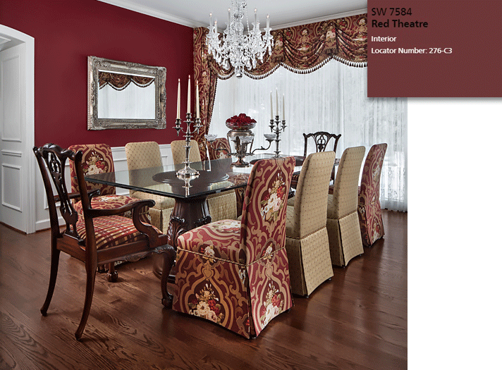
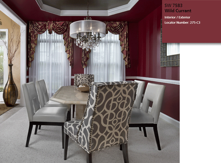
“Colors have a voice. They have a physiological effect on our minds, emotions, and bodies. Red, along with its tints, tones, and shades, is a very powerful hue that can stimulate the senses, encourage conversations, and increase the appetite. Hence it is a wonderful color to use in a dining room. For clients who desire dramatic dining rooms, I often suggest the deeper tones of red for the walls – those in the claret or burgundy families. Two of my go-to paint colors are Sherwin-Williams SW7584 Red Theatre and SW7583 Wild Currant. Red Theatre is more of a maroon or dark red-brown. Wild Current is a brighter shade. In the two dining rooms shown above, the particular colors chosen for the walls were influenced by the fabrics used for the window treatments. The Red Theatre walls were inspired by a screen-printed fabric from Vervain; the Wild Currant walls were inspired by a silk-blend fabric from Texture Fabrics.”
– Linda Shears, Linda Shears Designs
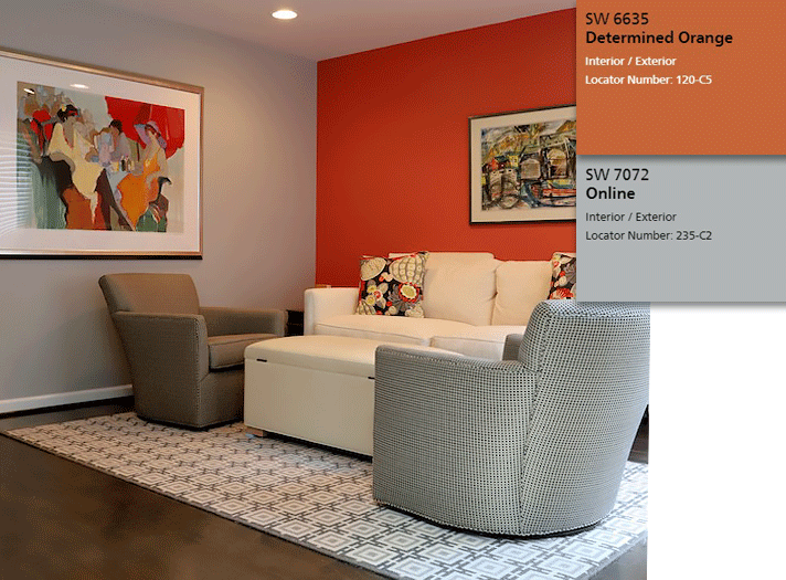
“In the room pictured above, I used Sherwin-Williams #7072 Online on the walls, which provided nice depth and did not wash out with the white ceiling. I needed an accent to complement the color in the pictures and pillows, so I chose Sherwin-Williams #6635 Determined Orange. To make this small corner of the room feel cozy I purchased two swivel chairs, a sofa, and a storage bench from RJ Thomas to use as a footstool as well as storage for throw blankets when not in use. The rug from The Ghiordes Knot was cut down for the area and the rest was used in the foyer entrance.”
– Lois Haron, Lois Haron Designs
“The 'neutral' color I often return to is what I call 'mushroom' or 'stone,' and it's a warm 'greige.' It's pretty in its lightest form as well as when it's deeper and more saturated. Any bright color pop works well with this neutral, but I prefer black or white accents, which are forever, sophisticated, and classic.”
–Amy Weinstein, AMW Design Studio
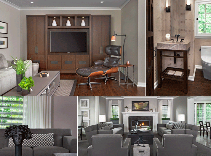
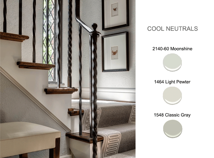
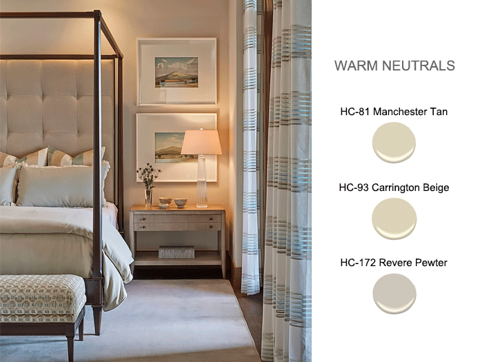
“When putting together a color scheme for a space, we typically gravitate toward a neutral background palette in either warm or cool tones and let the more dominant colors in the space present themselves through items such as area rugs, upholstery, drapery, and artwork. Though, typically, we will start with a specific rug or fabric selection in order to pull out the perfect coordinating background colors, I do have some go-to neutrals by Benjamin Moore that I find very versatile and easy to work with.”
– Kevin Serba and John Rattray, Serba Interiors