When it comes to art, the selection, proportion, and placement of your piece has a tremendous impact on your overall design. We asked six pros their advice to take the guess work out of your next project.
Photograph by Jeff Garland
CONSTELLATION OF COLORS
“This French Normandy home, designed in 1925 by architect Robert O. Derrick, became home to a collection of important contemporary art during its multi-year renovation. The large foyer was intended as a spot for brief meetings and cocktails with friends. This imaginative piece, titled Aquilla, (a reference to a constellation in the northern sky), is an oil on plywood by Toronto artist, John Kokkinos.
The space reflects the bold color palette that flowed throughout the home. The six-and-a-half-foot piece was selected after the room’s completion, and wasn’t intended to follow a particular decorative style. First and foremost, it was selected because the homeowners couldn’t live without it after seeing it in the artist’s gallery. That reaction is an important response to purchasing art, and my number-one rule. The strength of the design palette and the scale of the room are also considerations for the impact of art placement.” — Kathleen McGovern, Kathleen McGovern Studio of Interior Design
KATHLEEN’S ART TIPS:
- It’s lovely if your art coordinates with your room’s color palette—it means you are consistent in your color preferences.
- White is always a safe choice as a backdrop for your art, but a dark color such as navy or charcoal can make your art POP! When in doubt, experiment with a color first. Any color palette that captures the strength and feeling of the art is always a safe approach for providing a successful background.
- Metallic frames can look stunning and draw attention to your art on a dark wall.
- Don’t let the boldness of your wall color or wallpaper overpower your art. Your wall shouldn’t be the star—your art should.
Available at MDC: Tennant & Associates sconces; Rozmallin ottoman fabric and drapery trim.
Photograph by Beth Singer
FIRST IMPRESSIONS
“This newly built, modern, Prairie-style home in Ann Arbor was custom built. The first-floor primary suite is directly off the main foyer. Instead of leaving the doors closed, I saw an opportunity to create a focal point with lighting and art, so I worked with the architect to add a foyer. The client had a collection of art, and I selected this piece called Olympic Robe 1988, by Jim Dine, for its vibrant color and scale.” — Nicolette Martin, Nicolette Design Group
NICOLETTE’S ART TIPS:
- Art can bring any space to life by adding color and texture. Original art generates a feeling of opulence, relaxation, and reflection.
- Sometimes you can avoid a costly renovation or structural modification with a well-placed piece of art.
- Find a piece that speaks to you—its style and size will create the mood for the space as it’s often the first thing that catches your eye.
Available at MDC: Nicolette Martin Furniture sconce and picture light; Baker | McGuire chest.
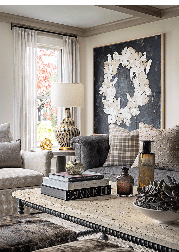
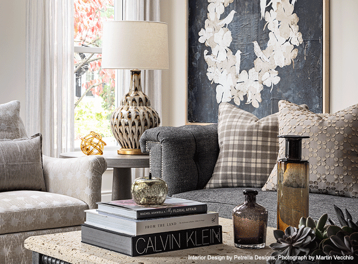
Photograph by Martin Vecchio
TANTALIZING TEXTURE
“This space was designed for a client who was looking for a calming, casual, yet sophisticated look for her home. We layered textured and geometric patterns in tones of gray, tan, and soft browns. The artwork by Pierre Marie Brisson was discovered in New York City. The color palette and texture add to the subtle design aesthetic for this living room.” — Lisa Petrella, Petrella Designs
LISA’S ART TIPS:
- Choose a cohesive color palette. Stick to a primary color scheme with two to three complementary colors to create harmony. Neutral bases with accent colors add depth and character.
- Layer lighting. Use a mix of ambient (overhead lights), task (reading lamps), and accent lighting (wall sconces, LED strips) to enhance mood and functionality.
- Make sure that the furniture in the space is balanced. Avoid overcrowding by ensuring furniture is proportional to the room. Use multi-functional pieces to maximize space in smaller areas.
- Incorporate texture and contrast. Mix materials like wood, metal, glass, and fabrics to add dimension. Rugs, throw pillows, and curtains can soften hard surfaces and make a space feel inviting.
Available at MDC: Tennant & Associates, Rozmallin, and Schumacher fabrics; CAI Designs furnishings.
Photograph by Laura McCaffery
COLLECTIVE EXPERIENCE
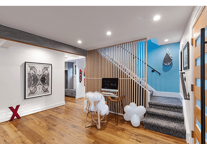
“The homeowner is an award-winning graphic designer, toy designer, and ceramicist who was looking to collaborate with us to design a home office for her. She decided that she didn’t need a lot of space, so she wanted her desk to be in the foyer of her Royal Oak home which has great light. The focal points in the new space are pieces from her large art collection. We featured a photograph by Andrea Einheuser on the wall near the red X on the floor which came from a vintage sign. The bird house on the blue wall was created by the homeowner, Jeannine Ceasar, while the print by the stair rail is by Charlie Harper. The Jack Light on the floor is by Tom Dixon and the Hat Trick Chair at the desk is by Frank Gehry. The art in the hallway is actually her husband’s skateboards. Each piece of artwork was placed in a way that gave them room to breathe and to be admired.” — Jennifer Baross, Dan Davis Design
JENNIFER’S ART TIPS:
- When placing art, keep in mind the optimum viewing distance. More intricate pieces need to be accessible for the viewer to see details up close. Larger impactful pieces need space for the viewer to be able to step back and appreciate the piece in its entirety.
- Consider the color palette in the space, but do not limit the art to only matching color schemes.
- When establishing art height on the wall, make sure the pieces in the entire space have a similar height so they feel cohesive.
- Be creative. Art is more than paintings and photographs. Architectural artifacts are wonderful when mixed with 2D art. If you have a drawing from your children, don't frame it in a simple boring frame—display it as if it’s a precious piece of art in a museum. It can always be swapped out as more art is created by your children down the road.
- Art should be personal and evoke a feeling or memory. It should give you a glimpse into the homeowners when you walk into the space.
Available at MDC: The Ghiordes Knot stair runner.
Photograph by Beth Singer
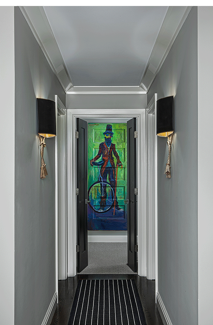
INTRIGUINGLY UNCONVENTIONAL
“The artwork in this space was a collaboration with local artists, Tony Roko and Darcell Deneau, created for a Variety- the Children’s Charity Detroit event held in a Troy home. The homeowner appreciates unconventional art, so the artists repurposed a one-hundred-year-old door to create an illusion that someone is welcoming them into the space. The striped rug assists in that illusion and the black and white hues are just so bold and beautiful when combined with the black French doors. It just feels seamless.” — Rita O’Brien, Rita O’Brien Interiors
RITA’S ART TIPS:
- Use old vintage wood frames. It’s a great way to repurpose older art and wood that you would otherwise turn a blind eye to.
- Repurpose your art by embellishing it yourself or have a local artist change the feel or purpose of the original piece.
- Create your own original artwork using circular or oval wood slices by assembling them in interesting patterns on your wall. You could paint them too!
Available at MDC: Rita O’Brien Interiors Tony Roko one-of-a-kind original paintings and giclée artwork.
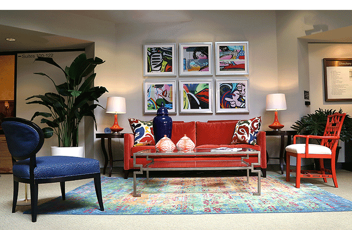
ARTISTIC ASSEMBLY
“We started this sitting area with a sofa covered in coral velvet. Wanting to highlight complementary colors, we grounded the room with an area rug featuring several different vivid shades of blue and coral. To further tie the room’s colors together, we added a collection of bold graphic prints above the sofa. Artwork is an essential design element in a room. In this space, the selection of the graffiti artwork brings the color pallet of cobalt blue and coral up onto the wall, serving as a focal point and enhancing visual interest.” — Linda Shears, Linda Shears Designs
LINDA’S ART TIPS:
- For a group of art to appear cohesive, all the pieces need to be read as a unit. Spacing is key to making this happen. Too much spacing can make the group feel scattered. In this installation, two to three inches were used between the graffiti prints.
- Do not leave a large space between the top of the sofa and the artwork. A huge gap negates the engagement between the artwork and the furniture.
- The width of a grouping should be about two-thirds the width of the sofa.
Available at MDC: CAI Designs sofa; The Ghiordes Knot area rug.